SIV Modernization - Highway Management System
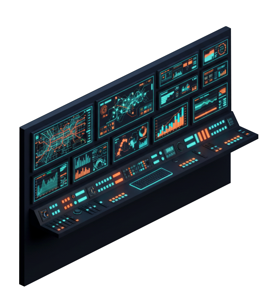
User-centered redesign of highway information management system for Movyon/ASPI. Innovative dashboard and metro-inspired synoptic visualization improved operator efficiency by 60% and reduced response times by 80%.
Results and Impact
Response Time Reduction
Usability Improvement
WCAG Accessibility Standards
The SIV project radically transformed highway information management through a user-centered approach that placed operators at the center of the design process. The widget-based dashboard eliminated the need to open multiple browser windows, while the metro-inspired synoptic made geographic visualization more intuitive and immediate.
Design Process
User Research & Discovery
Structured interviews with control room operators in 5 Italian cities (Rome, Florence, Pescara, Milan, Genoa). Collaborative sessions with whiteboard wireframing to gather requirements and pain points in real-time.
Functionality Mapping
Identification of 14 critical intervention areas: Dashboard, Events, Alarms, Roadworks, Rescue, Special Transports, Message Plan, Snow Emergencies, Road Crews, Dynamic Lane, Forecasts, Reports, Snow Points, Emergencies.
Iterative Prototyping
Development of interactive prototypes in Adobe XD based on collaborative wireframes. Continuous testing with end users and refinement through iterative cycles of feedback and improvement.
Design System & UI
Implementation in Figma with atomic approach: tokens for colors/typography, atoms, molecules, systems and complete pages. WCAG AA/AAA compliance for accessibility. 12-column grid base 8px for 1440px resolution.
Agile Development Integration
Iterative design process integrated with Scrum methodology. Continuous collaboration with development team through Figma dev-mode for efficient implementation consistent with design vision.
Key Innovations
Widget-Based Dashboard
Eliminated the need to open multiple browser windows. Customizable dashboard with widgets providing holistic view of information needed for event and emergency management.
Metro-Inspired Synoptic
Innovative visualization inspired by London and New York subway maps. Color-coding system for categories (red for alarms, blue for events) that supports operators' geographic mental model.
WCAG AA+ Accessibility
High accessibility standards for typography, colors and contrasts. Interface usable by all operators in any condition, with optimal readability even under stress or poor lighting.
Structured Design System
Atomic approach with tokens, reusable components and consistent patterns. 8px grid base ensures visual consistency and facilitates scalability for future system evolutions.
Interested in a Similar Project?
I can help you improve the usability of your complex systems through a user-centered approach and design thinking.
Let's Talk